top of page
Tags

Convert Bar Charts into Radial Bars
In some cases, radial bar charts can look nicer and be easier to understand than regular bar charts. Since Sisense doesn’t have a...
111 views
0 comments

Elegant Buttons to Switch Between Two Measures
When analyzing data, it’s helpful to see both actual numbers and percentage values. For example, you might want to know how many students...
144 views
0 comments


Add text field in Tooltip
We already have a script to add additional information in tooltip . But we can display only calculated values (measures) in tooltip...
484 views
0 comments


Filter Buttons v2 - With 'All' button
We already have a script to add filter buttons in a widget. Here is an upgraded version of the script which will add another button 'All'...
594 views
2 comments


Widget Refresh Button
In Sisense, widgets will be refreshed when - we reload the dashboard - change any filters - click on refresh button which can be found in...
164 views
0 comments


Buttons to Sort bars/columns
Sorting is very simple in Sisense. But this option is accessible only by chart editors. We can add buttons to sort the chart by name or...
238 views
2 comments


Disable/Deselect One or More Items in Legend By Default
In Sisense, all legends are enabled by default. Below script can be used to disable one more items in legend when load/refresh the widget...
163 views
1 comment


Target/Benchmark Line Based on Selected Filter
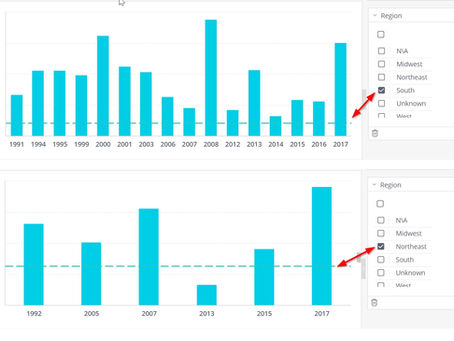
It is possible to add a benchmark/Target line to a chart using script. But there can be situations where we need to change the benchmark...
202 views
0 comments


Filter Buttons in Widget
Here is script to add filter buttons to a widget. There will be one button for each items in a dimension and we can filter to a...
520 views
3 comments


Apply style to widget buttons
We can add buttons to a widget for many purposes. Here are some examples we already posted: Switchable Measure Buttons Button to...
185 views
2 comments


Switchable Measure Buttons
Here is a script to add buttons to switch between different measures/calculation. For example, in below screenshot, each button represent...
418 views
2 comments


Total value in Column/Line chart
Using Blox we can visualize Total Value and sparkline to show values over time. Here is a widget script to create similar visualization...
498 views
3 comments


Group bars in Column/Bar chart
Pie chart has an option to display top n slices and group rest of the slices to a single slice called 'Others' . While we click on that...
191 views
0 comments


Custom No Result message
Below script will allow you to change default 'No Result' message to any message you want. It is possible to apply different messages to...
411 views
0 comments


Display value labels inside bar
By default, in Column and Bar charts, all value labels are displayed outside bars. But here is a way to display values inside bar Steps:...
208 views
0 comments


Button to change widget type
By default, only data designer can change the widget type. Below script will add buttons to a widget, so that user can change the widget...
367 views
1 comment


Add subtitle to Widget
Sometimes we may need to add some more information about the data displayed on the widget. i-button is an option to add this...
241 views
2 comments


Dynamic widget title and axis label
There can be situations where we need to display widget title and axis labels based on selected item in filter. Here is a script to...
388 views
2 comments


Display total value in legend - Bar/Column/Area/Line chart
A column chart splits the data by one or more dimensions and we have to manually sum up or create a separate widget to find total value...
279 views
0 comments


Add additional information in tooltip - (Column, Bar, Line, Area chart)
Sometimes we may need to include more information in tooltip. Here is how we can achieve this. Steps: Create column/bar/line/area chart...
787 views
3 comments
bottom of page
